
Lab: Designing Microinteractions
Estimated time: 45 minutes
What you will learn
In this lab, you will learn how to design smooth and engaging microinteractions for basic UI elements such as buttons, toggles, and icons. You'll use Figma's prototyping features and variants to simulate interactive behaviors that respond to user actions like clicks or hovers. This experience will help you build user-friendly designs that communicate feedback, status changes, and enhance the overall UX of a digital product.
Learning objectives
By the end of this lab, you will be able to:
- Define and explain the role of microinteractions in user experience
- Create UI components with interactive states such as click
- Use Figma's Variant and Prototype tools to simulate microinteractions
- Apply Smart Animate and transition timing to add motion and feedback
- Build and test real-life UI microinteractions in a live prototype
Prerequisites
- Basic understanding of Figma (drawing shapes, using text, aligning elements)
Note: If this is your first time using Figma, we recommend creating an account. To do this, right-click Getting Started with Figma and open it in a new tab to sign up.
Introduction
Microinteractions are the small, functional animations that bring a user interface to life. From a heart icon that fills when clicked to a button that turns into a spinner while loading, these subtle moments of interaction play a big role in improving user engagement and providing visual feedback. In this lab, you'll explore how to design such microinteractions using Figma, focusing on real-world examples from an online wellness store. You'll learn to use Variants, Prototype links, and Smart Animate transitions to simulate user behavior and elevate the usability of your UI components. By the end of this lab, you'll be able to create and preview interactive elements that feel responsive, intuitive, and polished.
Scenario
Design brief You are working on the design for an e-commerce website selling organic skincare and wellness products. The brand wants to offer a delightful and intuitive experience by adding microinteractions to its product pages. Your task is to design a microinteractive element that simulates real user behavior:
- A Like (Heart) icon that animates when clicked
This subtle animation will help users feel in control and receive feedback when they interact with the interface.
Part 1: Getting started
Step 1: Open Figma and create a new file
Open Figma in a new tab by right-clicking this link and logging in.
After logging in, you will be redirected to your Figma Dashboard, click the "Design" card visible in the dashboard, as shown in the screenshot with the highighted red border.
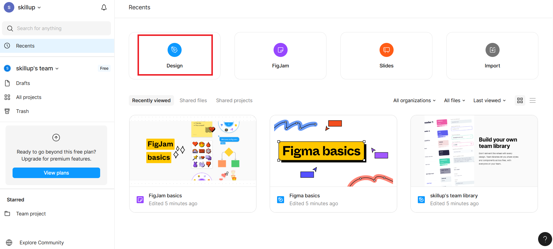
It opens a blank canvas titled "Untitled".
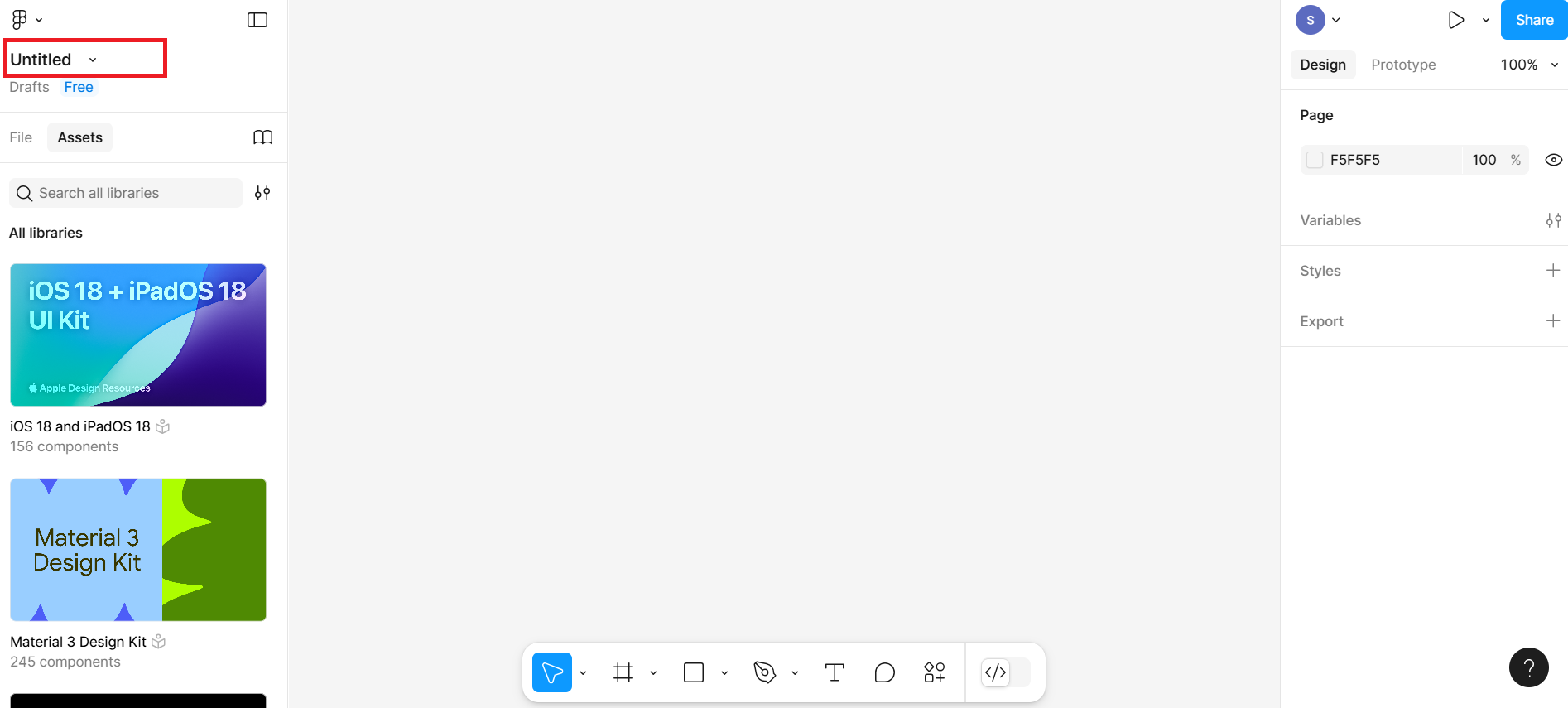
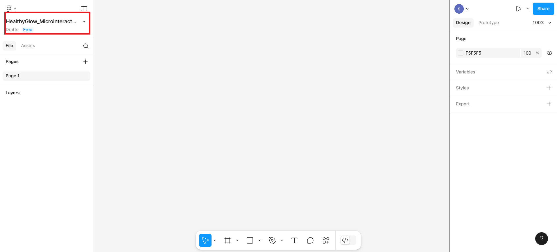
Click the Untitled file name at the top and rename it.
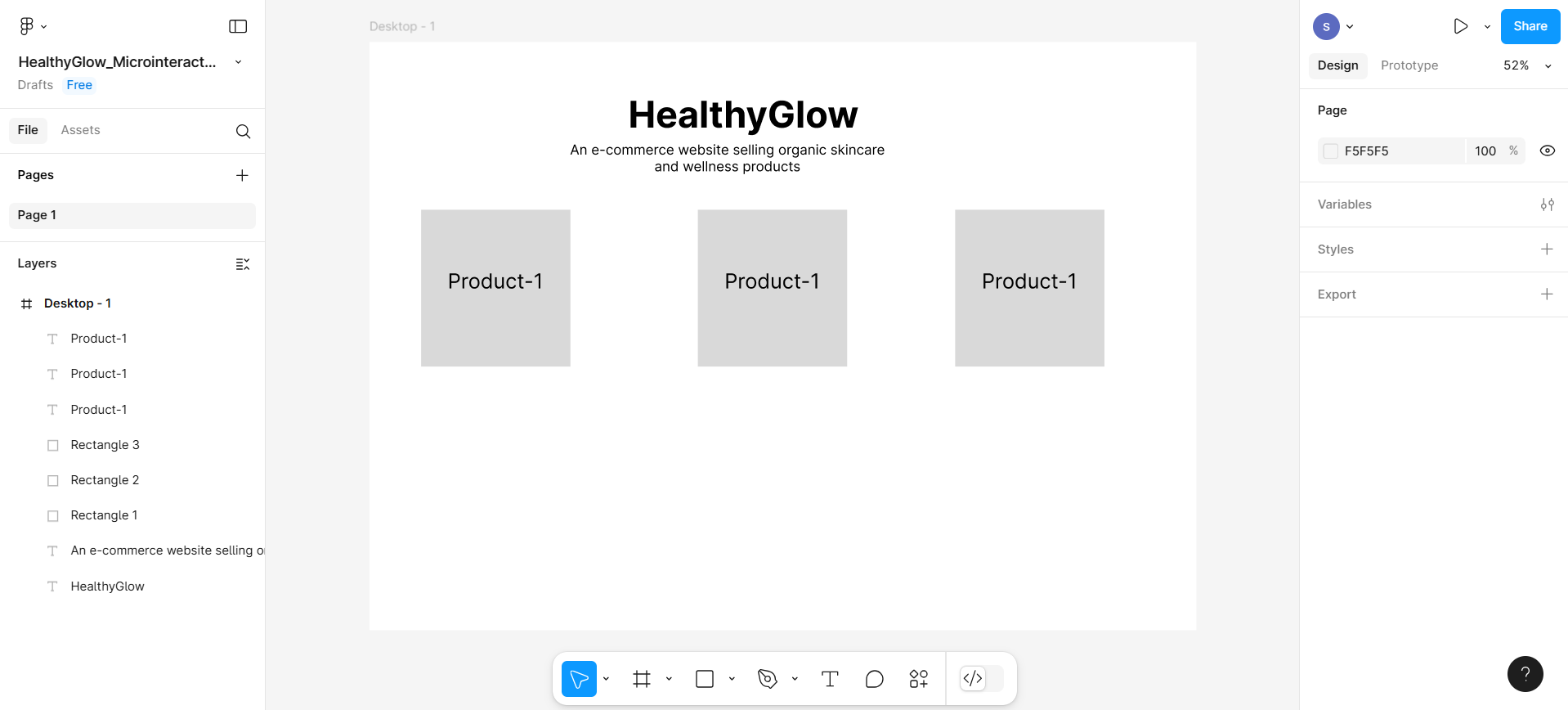
Part 2: Create a wireframe
In this part, you will create wireframe structure which will include heading, subheading, products display cards with add to cart button, and one icon for favorite product.
Step 1: Create header section First, create the header section by following the given steps:
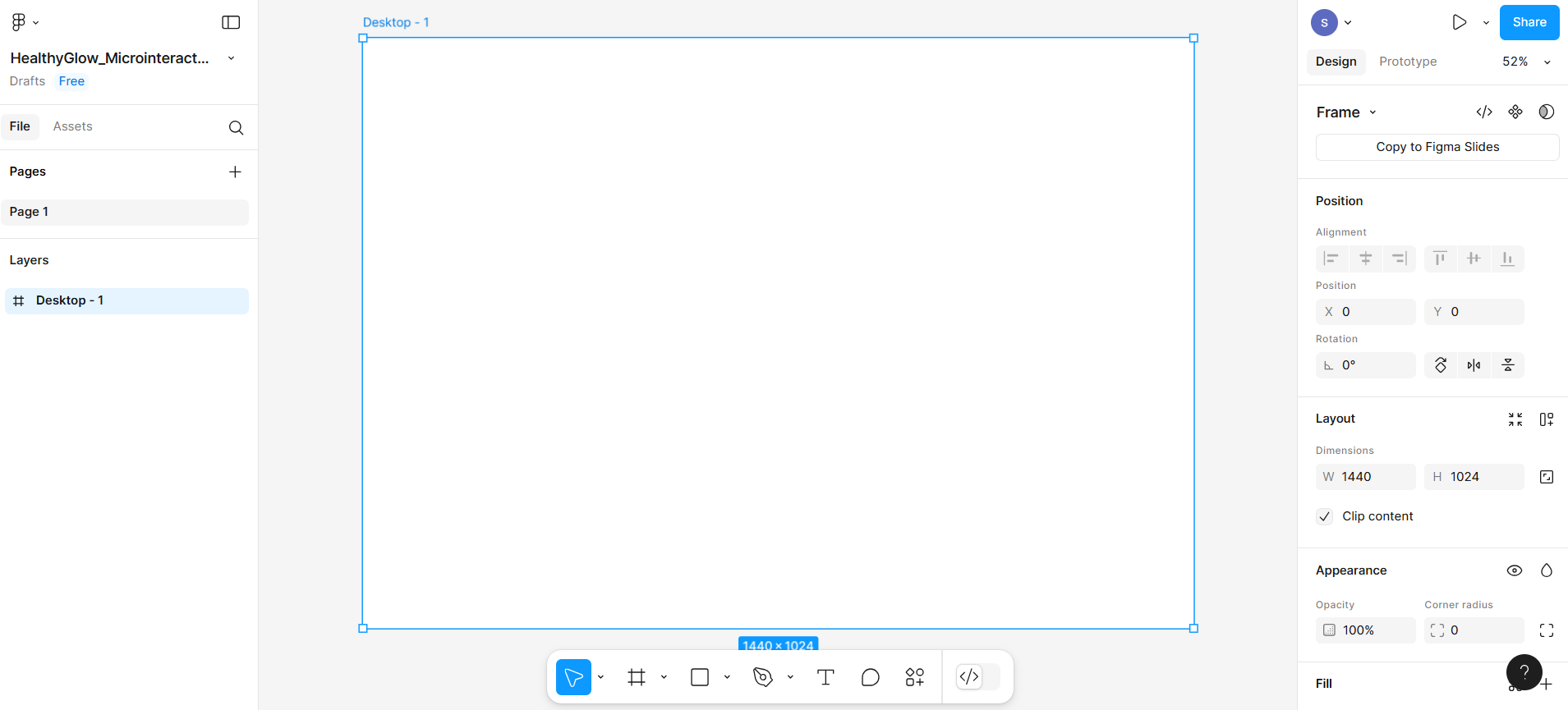
- Create frame section from bottom menu bar as shown at number 1 in the given screenshot and then select Desktop option from the right-hand sidebar shown at number 2 in the given screenshot.
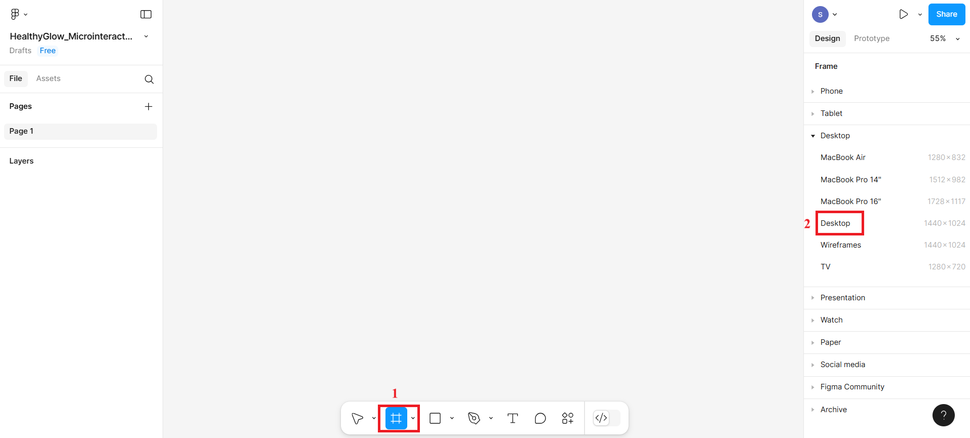
- The desktop frame will look according to the given screenshot.
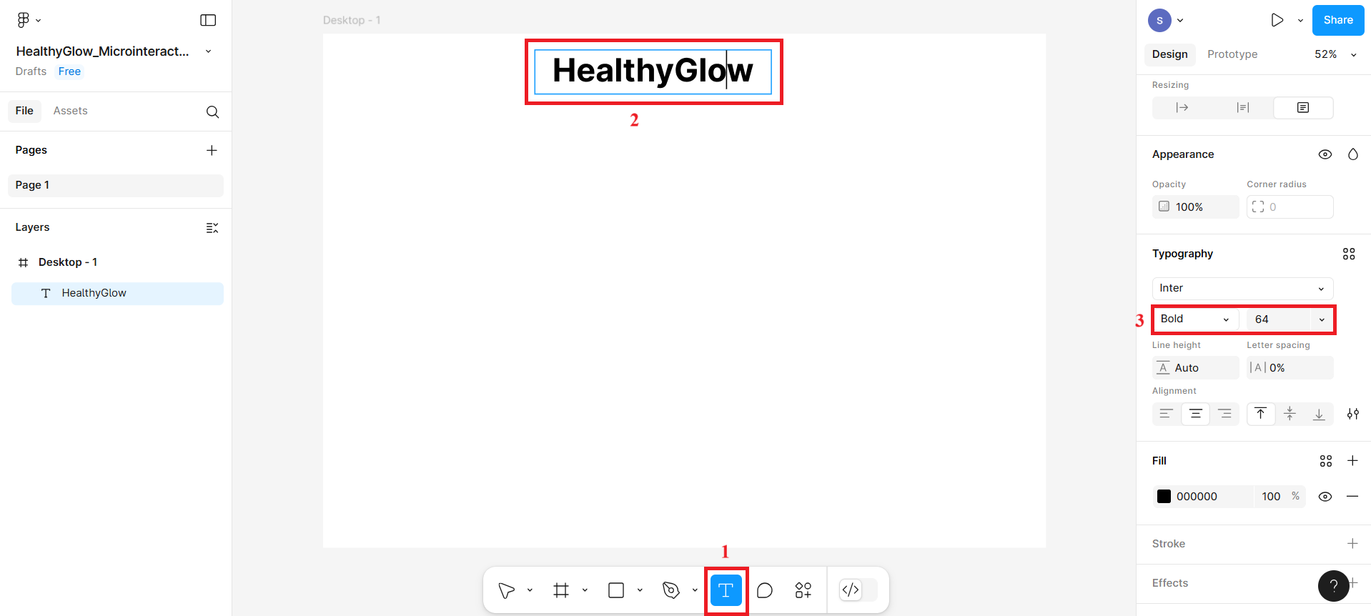
- Now select T for text from the bottom menu bar as shown in the given screenshot at number 1, and then click the top of the desktop frame to write the main heading as shown at number 2. Also adjust the size of this text and weight for this text, as shown in the given screenshot at number 3.
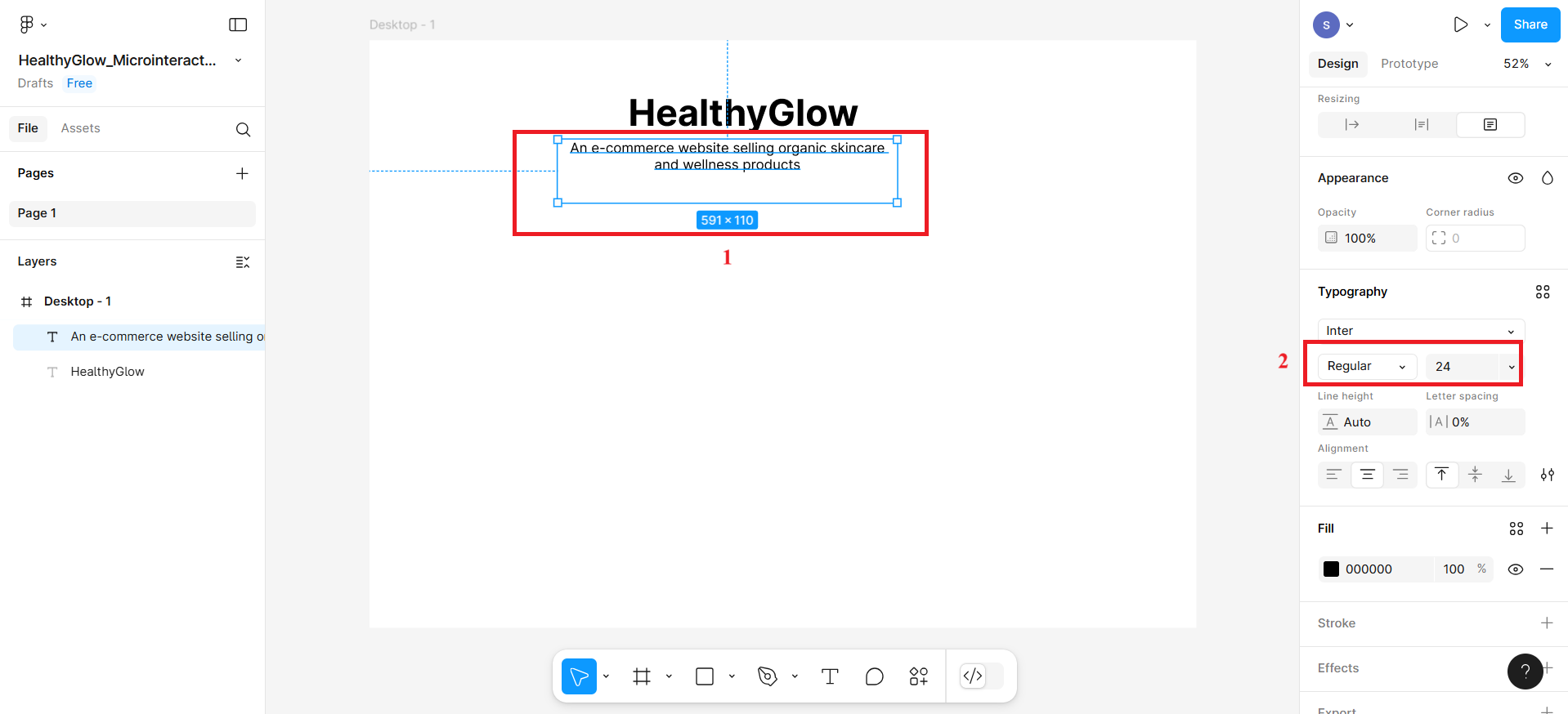
- Then, create one more subheading with text An e-commerce website selling organic skincare and wellness products using T text from the bottom menu bar. Adjust the size of the text and make it appear regular.
Step 2: Create product card
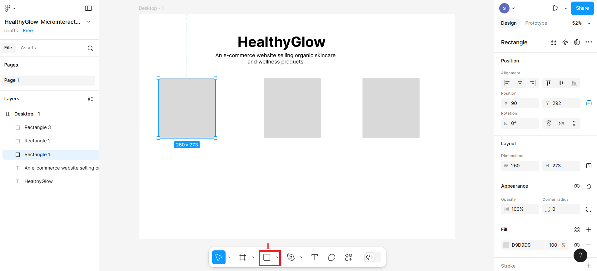
- Now create three rectangle boxes to represent them as product cards to display product.
- To display products names for these three rectangle boxes, use T from the bottom menu bar and click the top of the rectangle boxes to write the product names such as Product-1, Product-2, and
Product-3.
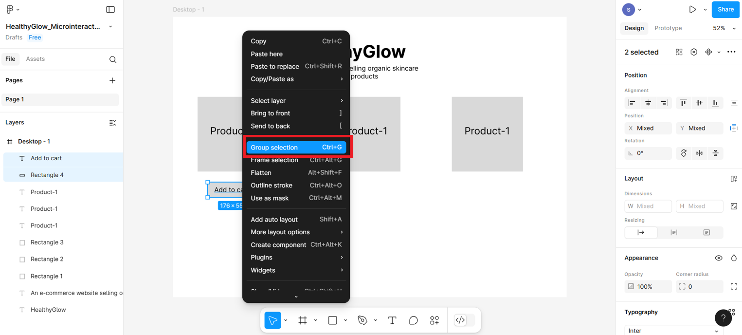
Step 3: Create button and favorite icon
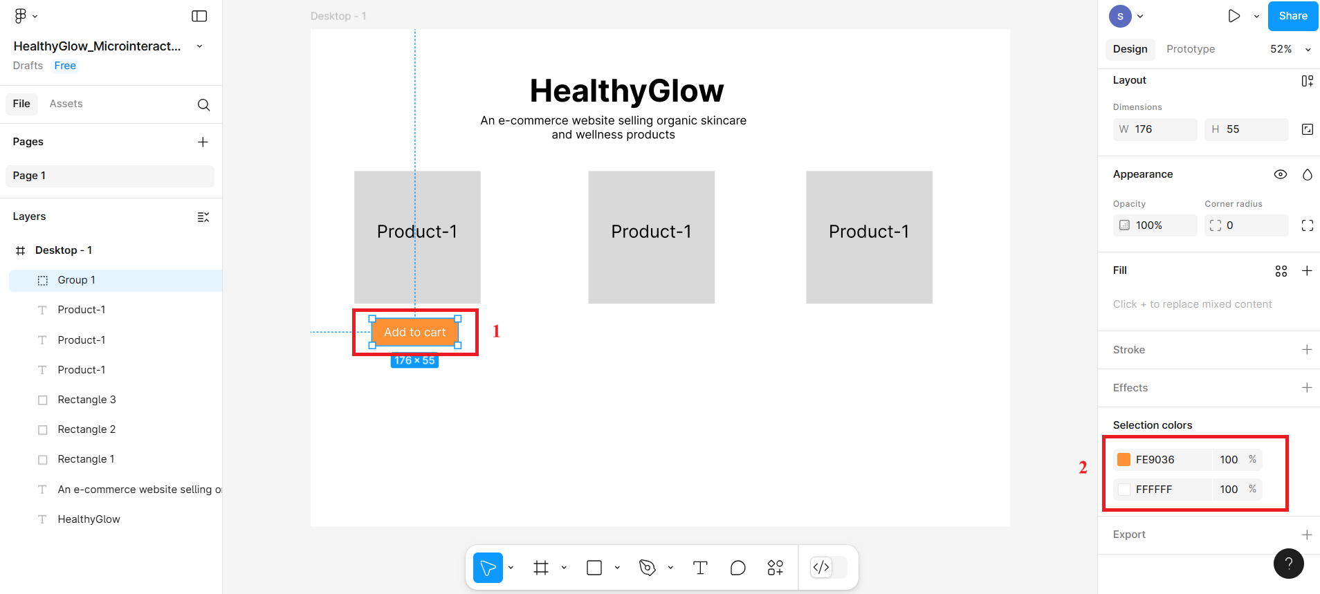
- Create one more rectangle box below product-1 card and write text within it as Add to cart. This will represent a button Then select both rectangle box and text box with the help of shift key and press right-click. Then, select Group Selection. This will help these two boxes to group together as a single unit.
- Select the button and fill the background and text with color. In the given screenshot, the red box labeled with number 2 displays two colors—one for the text color and the other for the button's background color; however, these can be vice versa, with the first representing the background and the second representing the text. You can select any color to customize both the button and the text.
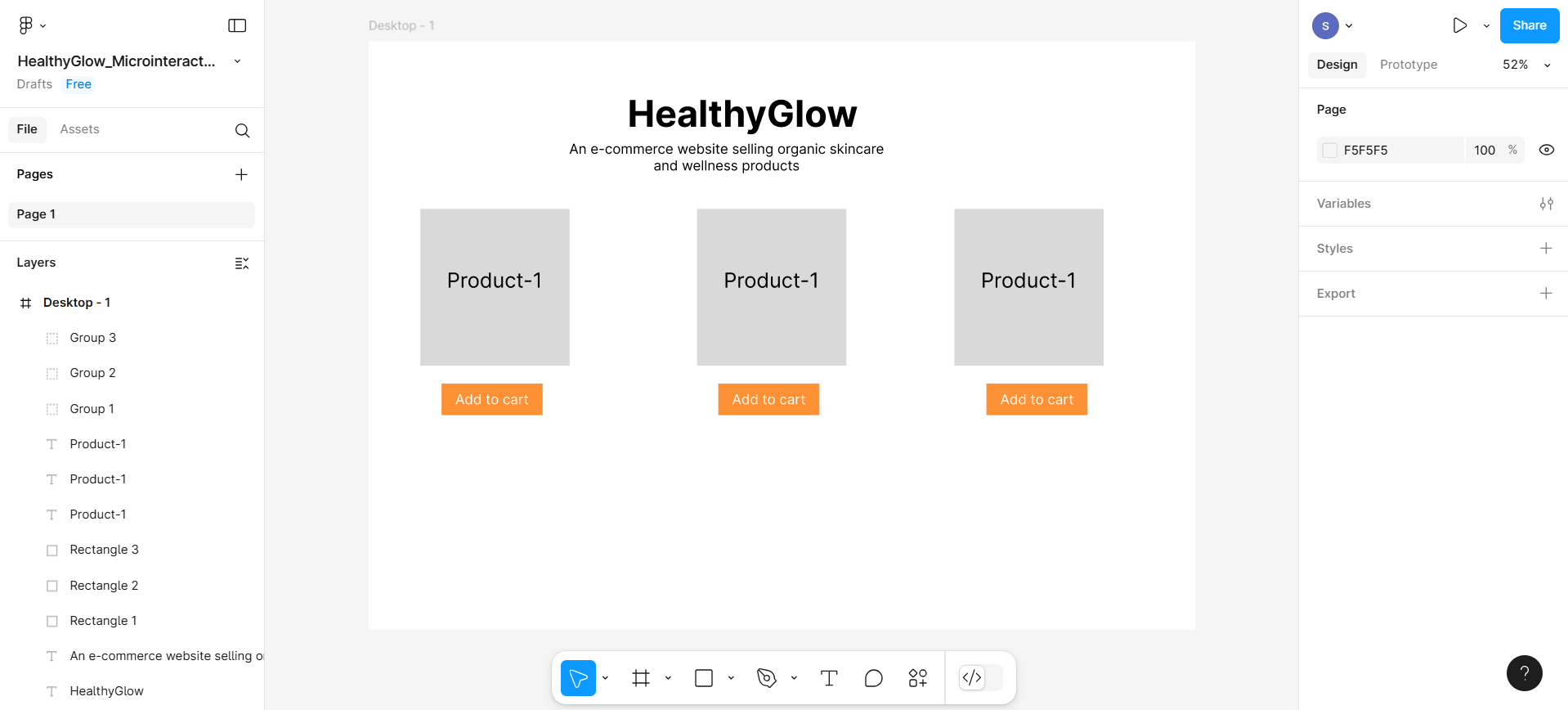
- Then, create variant of this button using ctrl+ d command.
Note: After using the Ctrl + D command, if you don't see the duplicated button, it may be hidden beneath the original—try dragging the original button to reveal the duplicate and use it to create a variant.
- To add an icon representing the wishlist, you need to install a plugin. Click the icon labeled as number 1 in the top-left corner of the given screenshot, then select options 2 and 3—this will open a pop-up box.
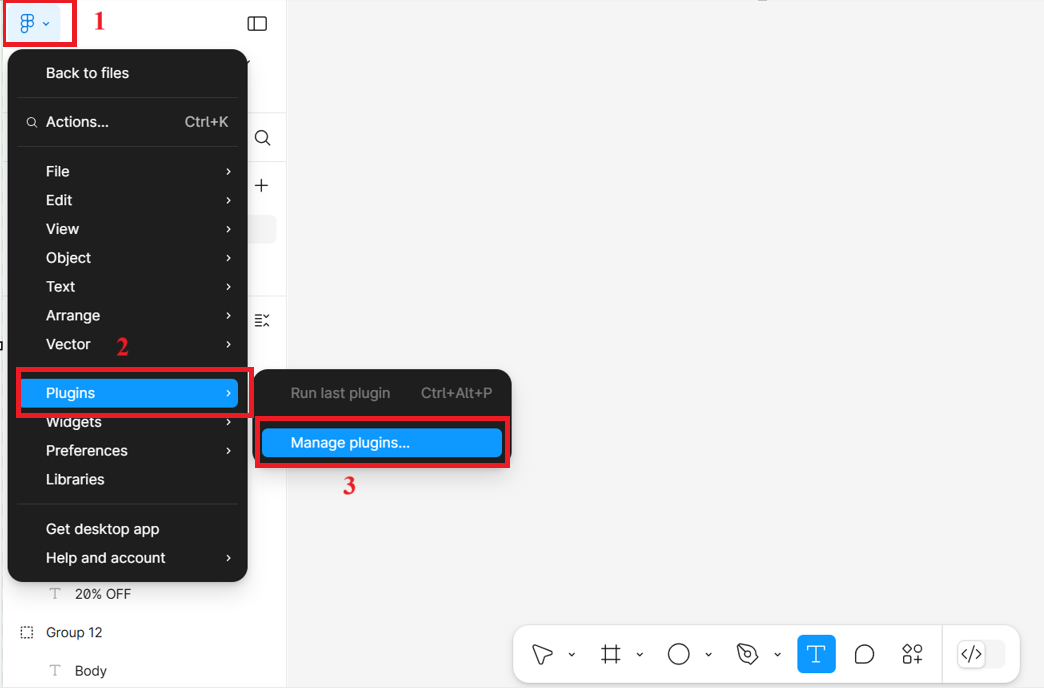
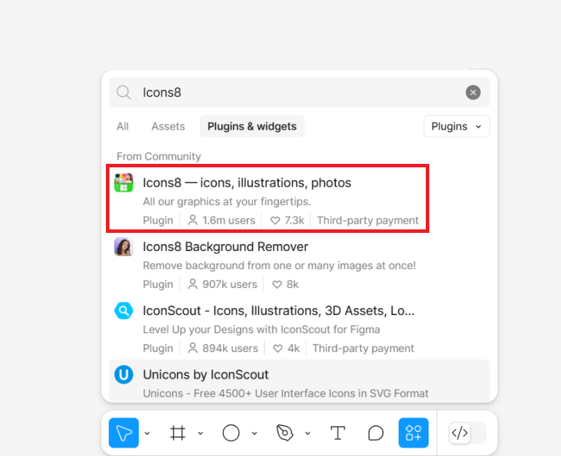
- Search for plugin named Icons8 and select the first one shown in the given screenshot.
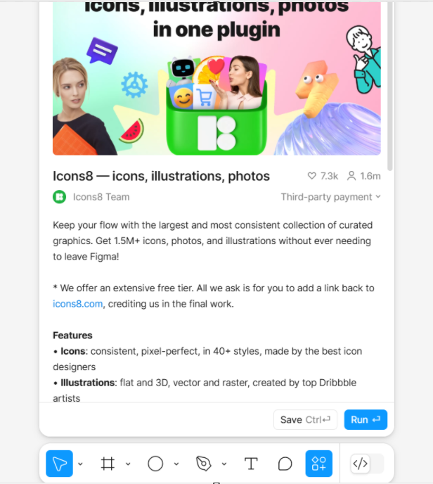
- To install it in your figma account, you need to install it after clicking on Run button.
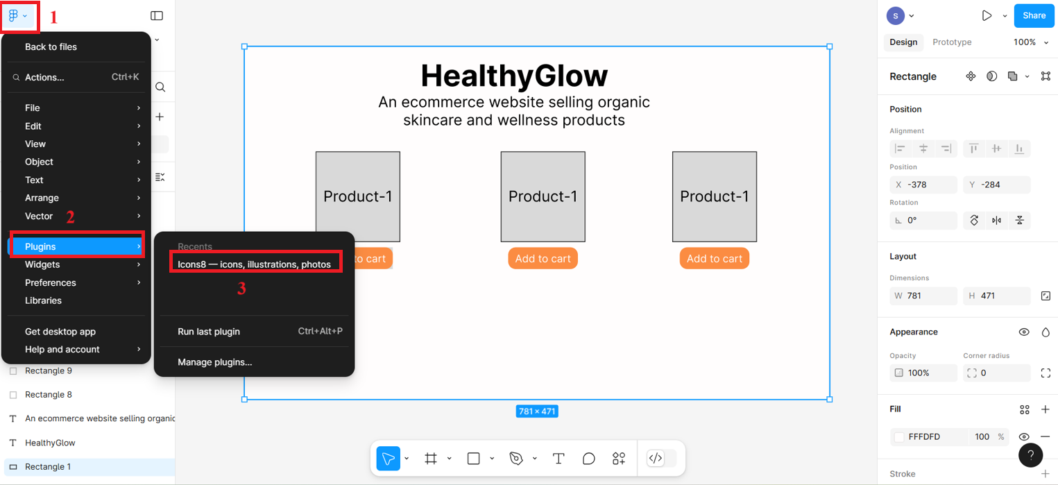
- After installing, a pop-up box will appear immediately, from where you will search for heart icon (named "Favorite") and select the heart icon. If plugin is already install then you can choose Icons8 option as shown in the given screenshot and then pop-up box will appear from where you can select the heart icon.
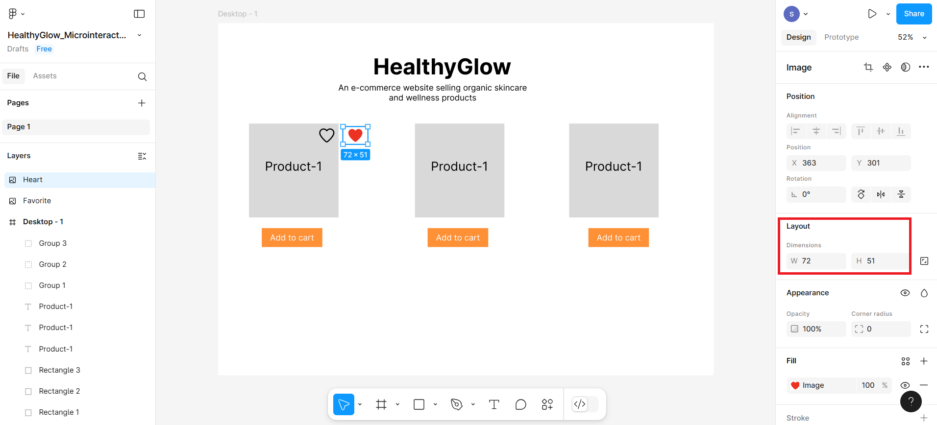
- Choose heart icon with black border only. After selecting the icon, it will appear on the frame—you can drag it to position it precisely and resize it as needed.
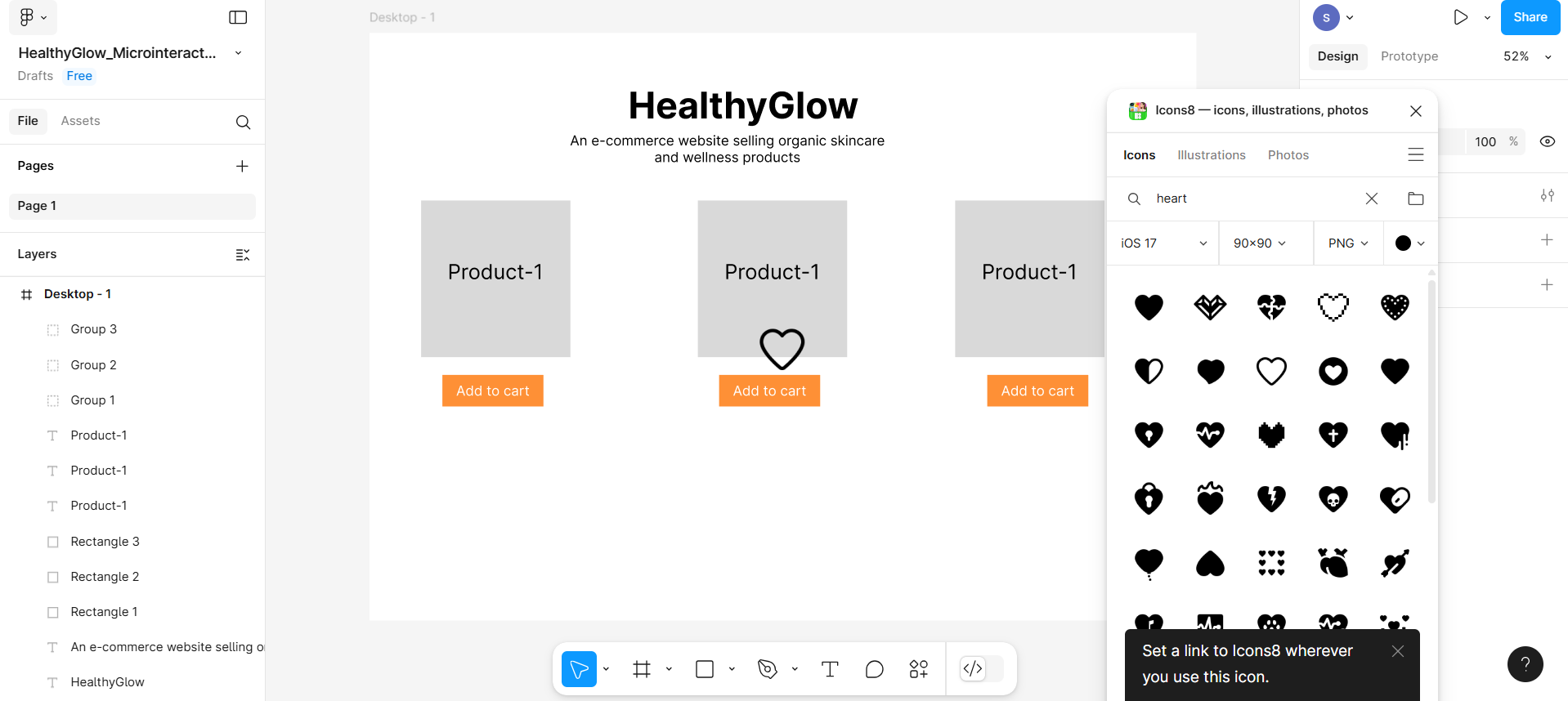
- Now search for red color icon again after selecting the color. You can choose heart icon filled with entirely red color. This filled heart icon will be named "Heart".
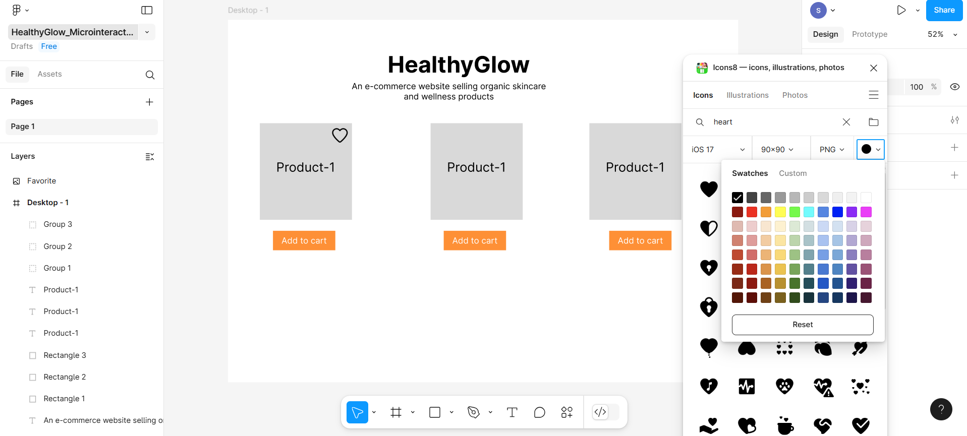
- Place both icons next to each other and also adjust the size of both the icons similar to each other.
Part 3: Create microinteractions
In this section, you'll create a microinteraction—for example, selecting the heart icon to add a product to the wishlist, which changes the black heart icon to red to indicate it has been selected.
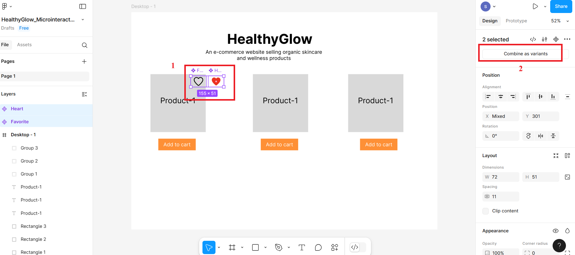
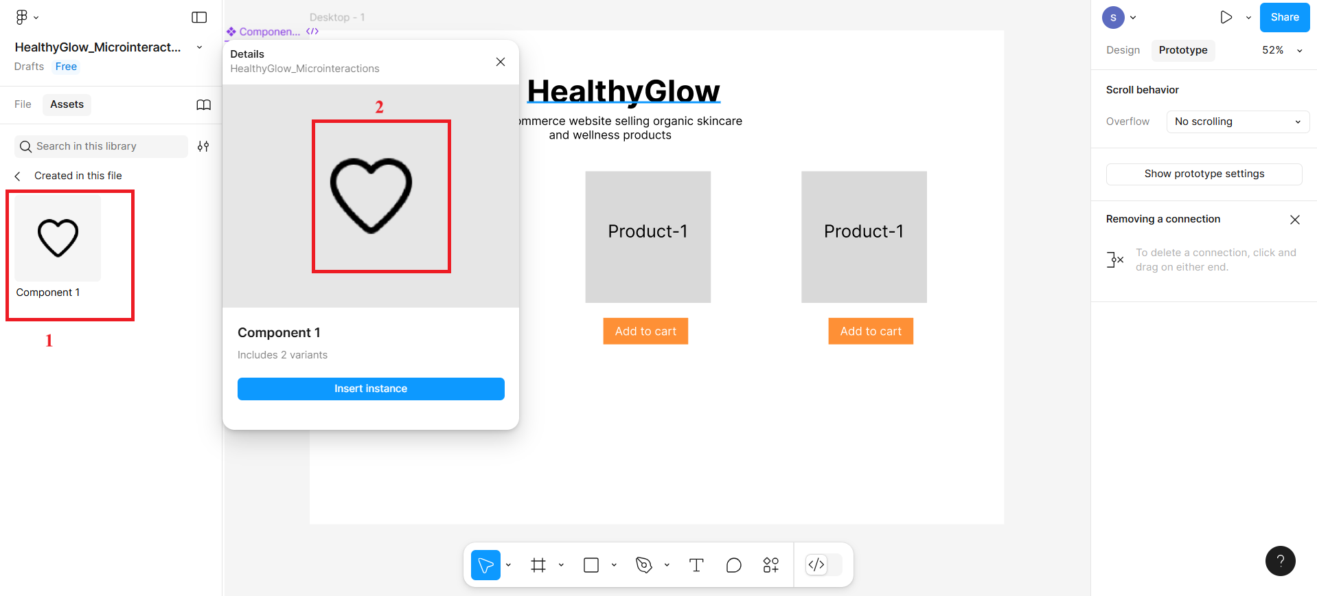
- Select the first icon represented at number 1 in the given screenshot and then click the other icon represented at number 2 to create a component for the icon. Do the same with the other red color heart icon as well.
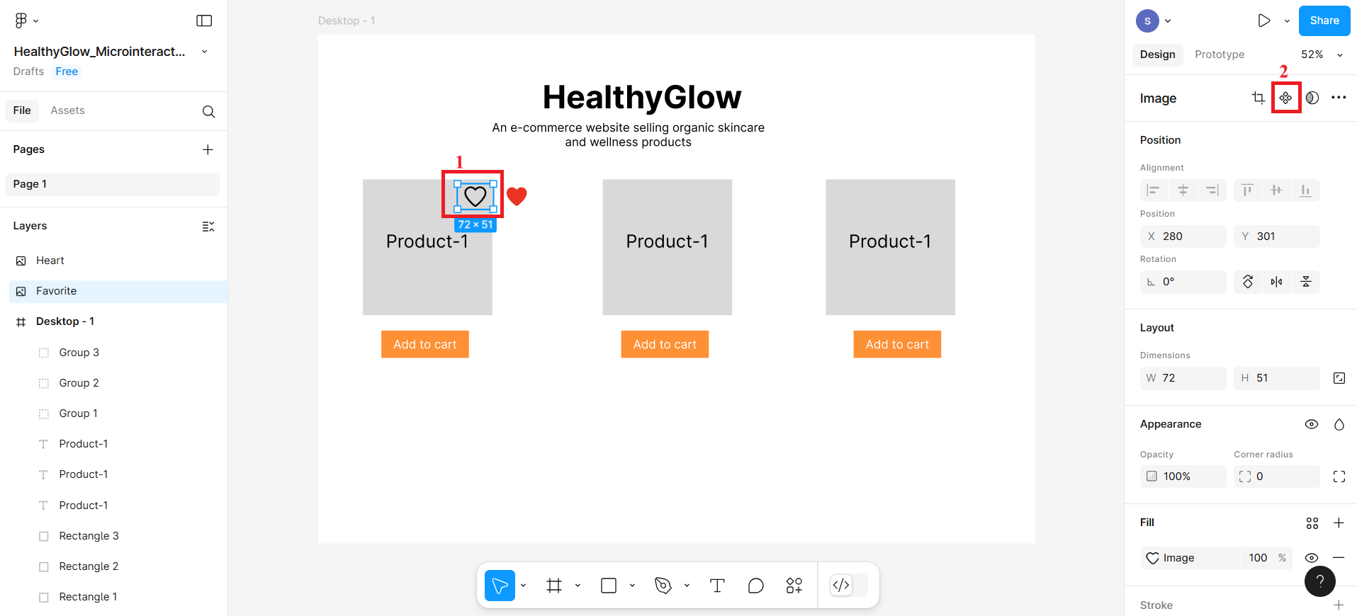
- Then, select the both the icon together using shift key and click Combine as Variants.
Follow the given steps to create microinteractions:
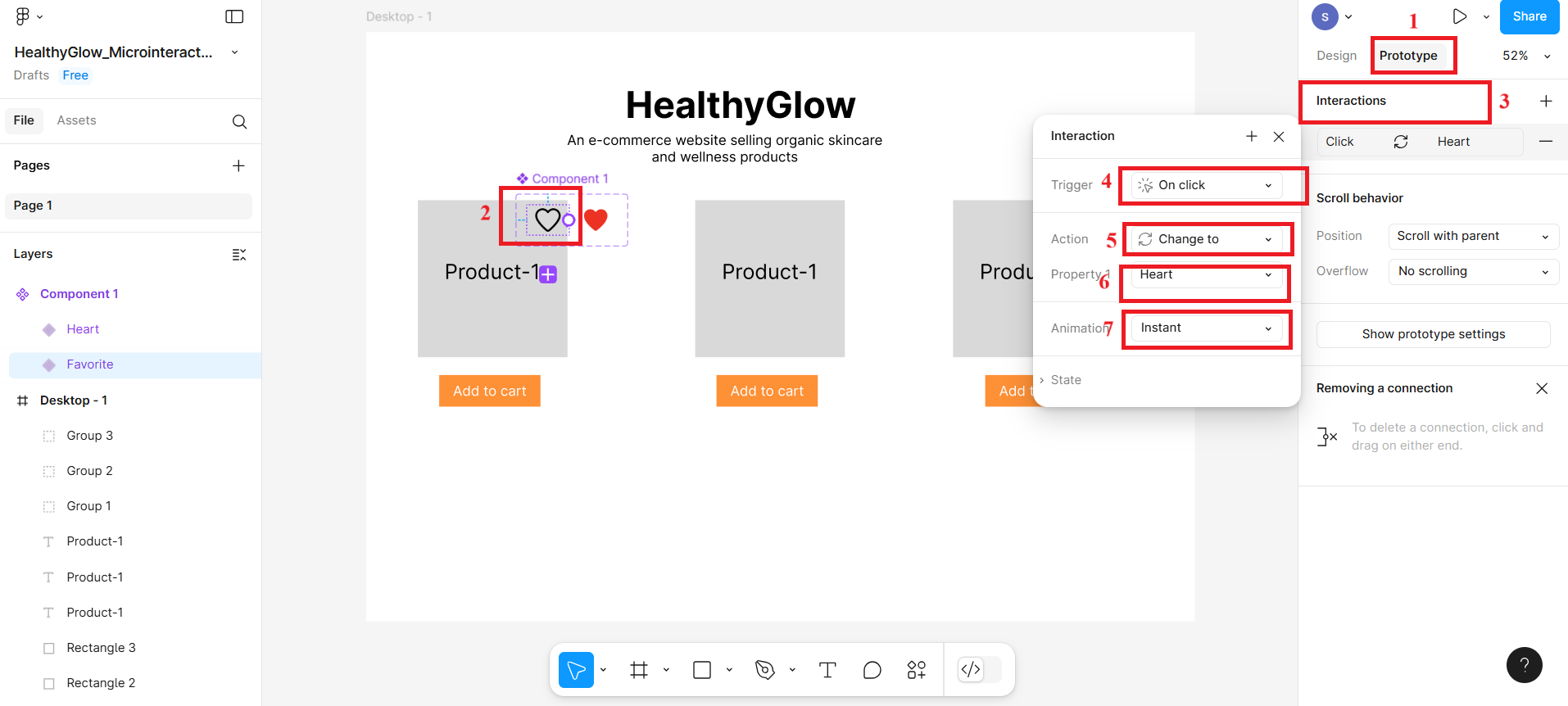
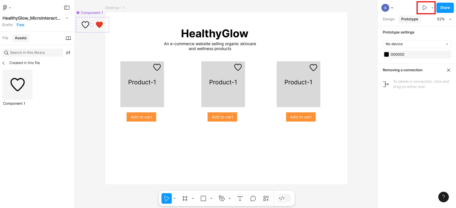
At the top-right, you've clicked on the "Prototype" tab. This allows you to define interactions between components and frames.
You selected the heart icon component (named Component 1) which has multiple variants (likely filled and outlined heart).
Click the "+"button under Interactions at number 3 is used to create a new event (e.g., what happens when someone clicks the heart icon).
You set the Trigger to On Click. This means the interaction will activate when a user clicks the heart icon.
Action "Change to "tells Figma to change the variant of the component when clicked. You're switching from one version of the heart (e.g., outline) to another (e.g., filled).
Property "Heart" defines which property or variant is being changed. In this case, the property controlling the heart's appearance (e.g., outlined vs. filled) is named Heart.
Animation "Instant" is used for the transition to happen instantly without any animation. You could choose other options like "Smart Animate" if you want a smoother visual effect.
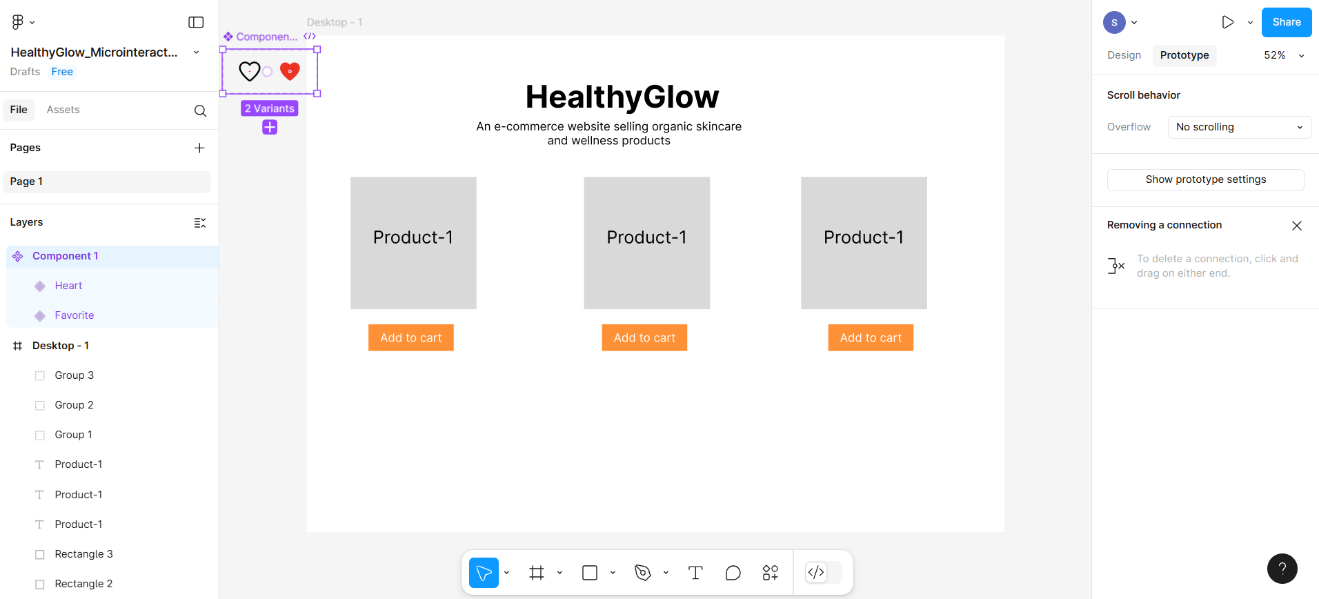
Now select the variants and drag them outside the desktop frame.
Now click on Asset tab and then select the component box under the libraries represented at number 2 in the given screenshot.
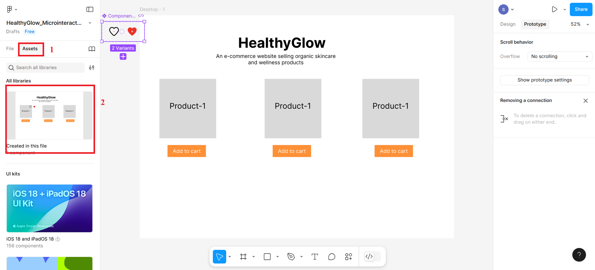
After clicking the component box, you'll see the heart icon component. Click the icon, and a pop-up box will appear—you can then drag the icon to place it exactly where you want.
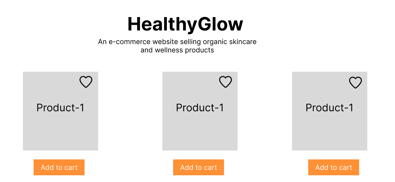
After placing the heart icon, the entire frame will look like according to given screenshot. Then, click Present icon from the top right corner and it will open the preview section.
In the preview of this wireframe, the output will be according to the given screenshot.
Then click the heart icon; it will change to red color heart icon.
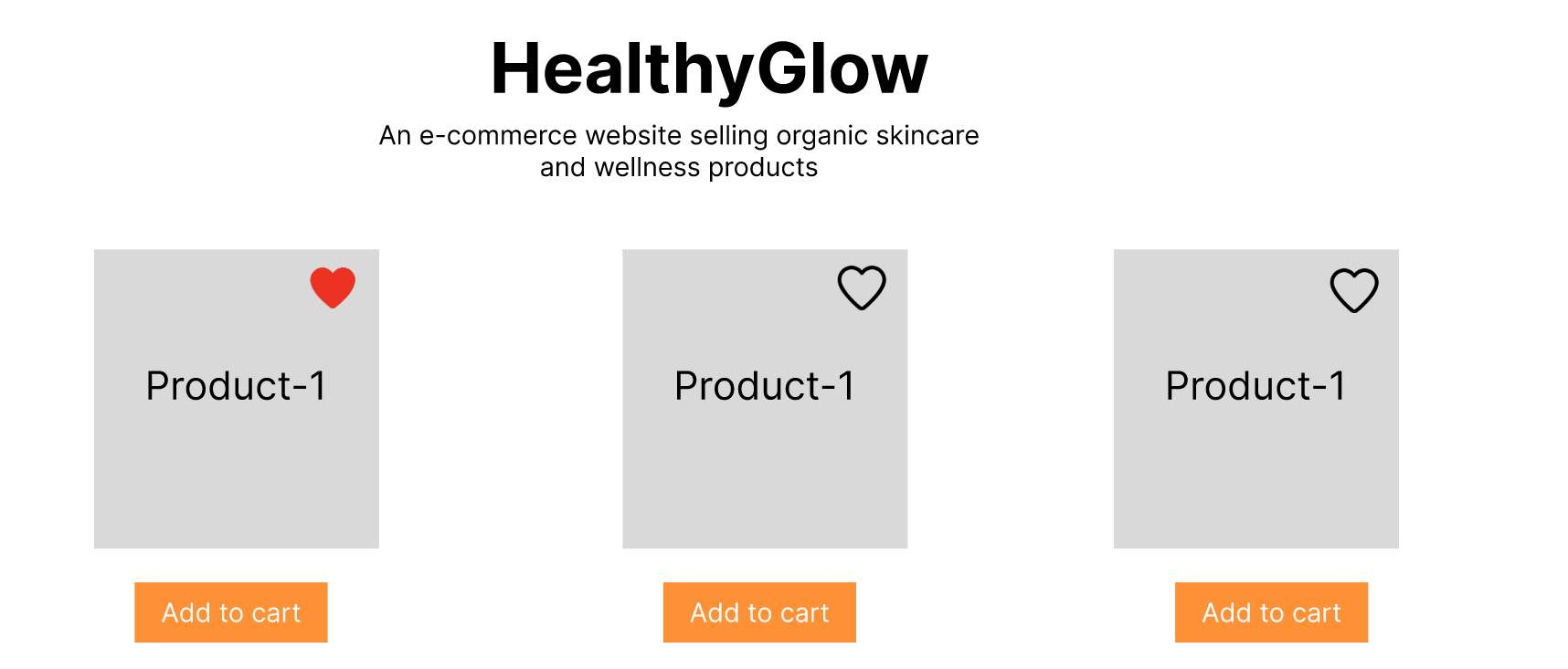
Final design
The final design can be previewed after clicking the preview button.
Summary
In this lab:
- You designed interactive UI components that simulate real-life user behaviors such as clicking, toggling, and loading.
- You learned how to use Figma's Variants, Prototype mode, and Instant Animate to bring life to your designs.
- You explored how microinteractions enhance user satisfaction by providing immediate visual feedback, making interfaces feel responsive and engaging.
- You discovered how these techniques can be reused and scaled within larger UI design systems and user flows.
Practice Task
- Create a button frame:
- With the text “Add to Cart”
- Set its fill color to orange.
- Duplicate the frame and change the text to “Go to Cart”, with the fill color changed to green.
- Apply a Smart Animate interaction between the two frames on tap or click.
- Set the animation type to Smart Animate with ease out and a duration of around 300ms.
- Ensure the text and background changes are aligned between both frames for smooth animation.
- Preview the prototype to test the microinteraction flow.
Author(s)
Richa Arora